Intuit Local
Being one of my first jobs I try to keep this case study on my portfolio as a reminder of where I started and show the evolution of things. This case study however, has an interesting perspective on appointment calendars which I still use from time to time as a way to change up the common experiences we have on the web to this day.
I worked on a product called Intuit Local which was a yelp targeting small service-based businesses that also enabled them to receive verified reviews. I was the sole designer on this product at the time.
Before we get to the full case study, I would like to discuss my first win as a designer conducting their first A/B experiment ever. It's a simple silly win, but at the time it was quite exciting. My initial win was adding calendar icons that were recognizable to users to add their newly booked appointment to their phone calendar. It may seem obvious now, but surprisingly I had to fight to get it implemented and used Optimizely to do a soft-release.
The results? Simply adding the Outlook calendar and Apple calendar icons to add to 'iCal' and 'Outlook' increased conversion by over 35%! This in turn meant reducing the amount of forgotten appointments for our small business customers.
This sparked my interest to investigate the UX field even further. To aid in this journey, my manager at the time tasked me with the challenge to increase conversion of the booking appointment form. This case study is my first case study.
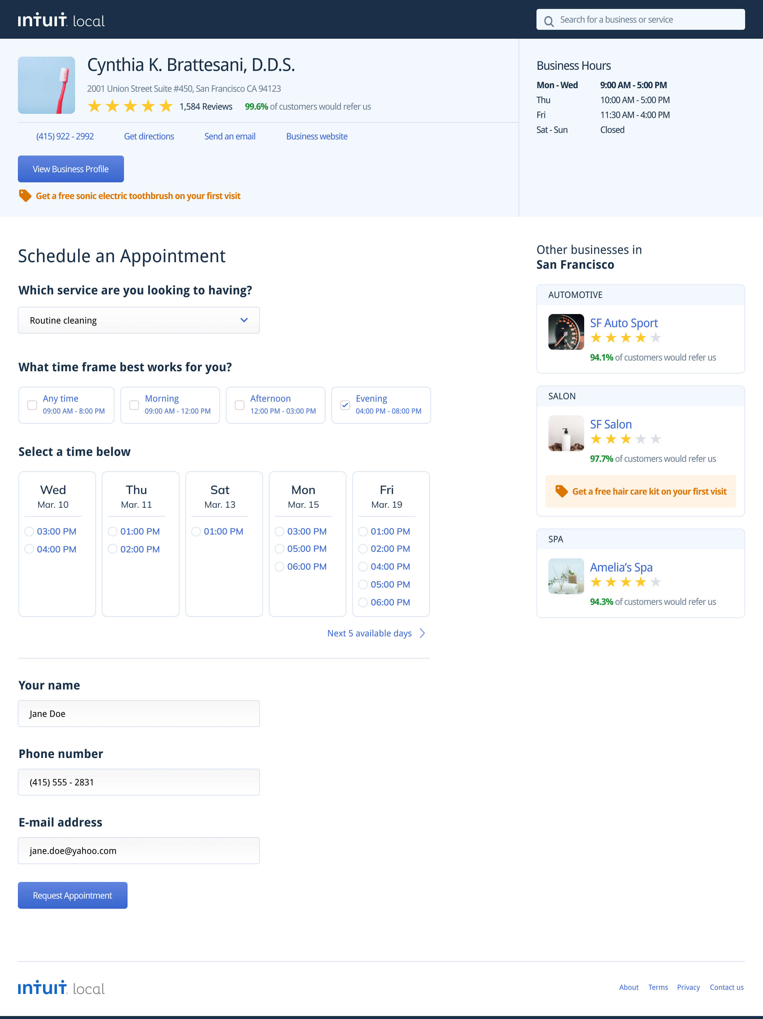
Creating a booking calendar
Our calendar to book appointments looked like any other on the web, select a date with the native UI and proceed to select a time. If a time you need is not available on that day, proceed to the next day and again look at the times listed.
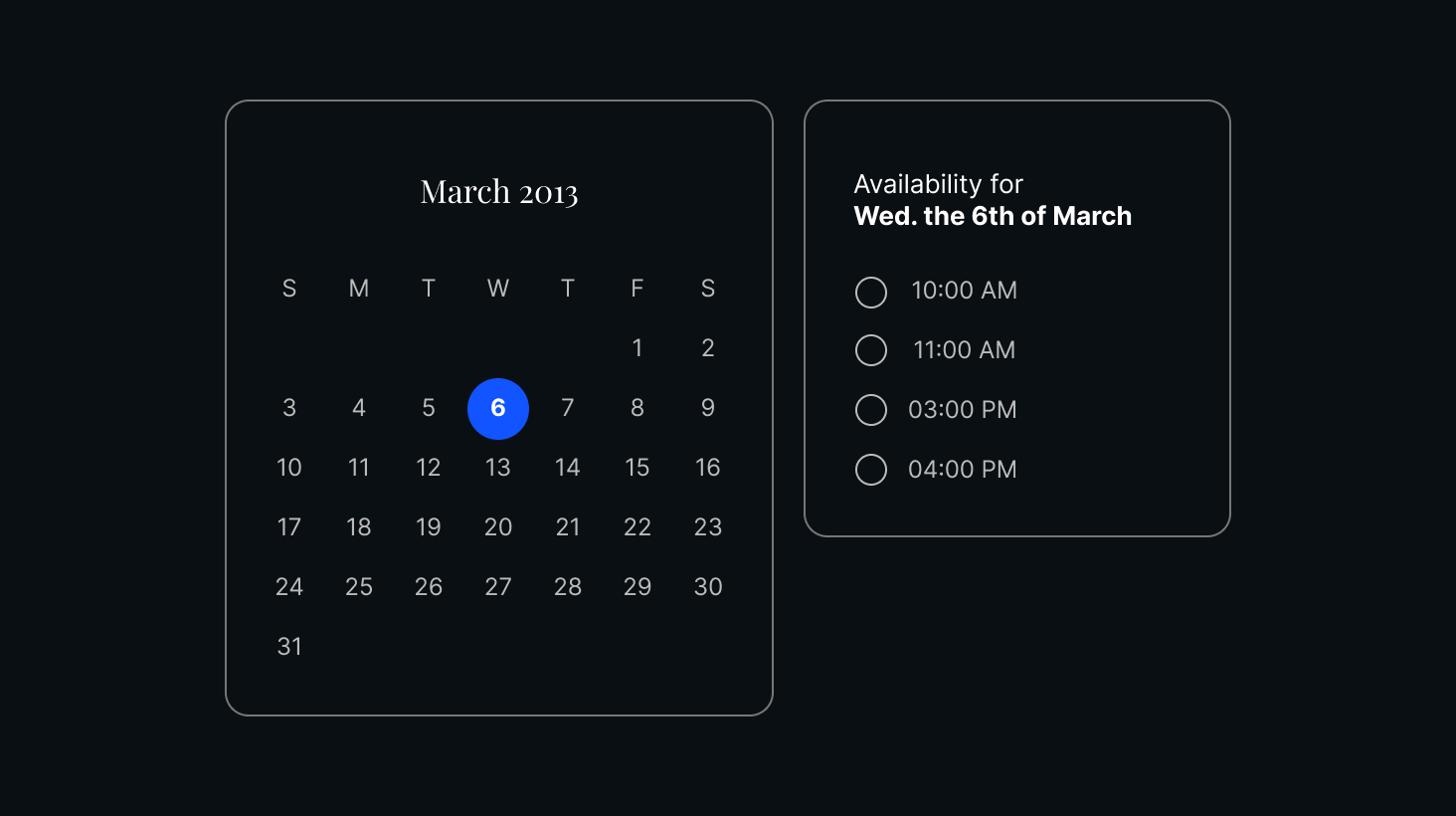
This process of continuously selecting different dates to see if a time matches is the most tedious process of booking an appointment. Luckily, I had a dentist appointment coming up and I could take a real case scenario.
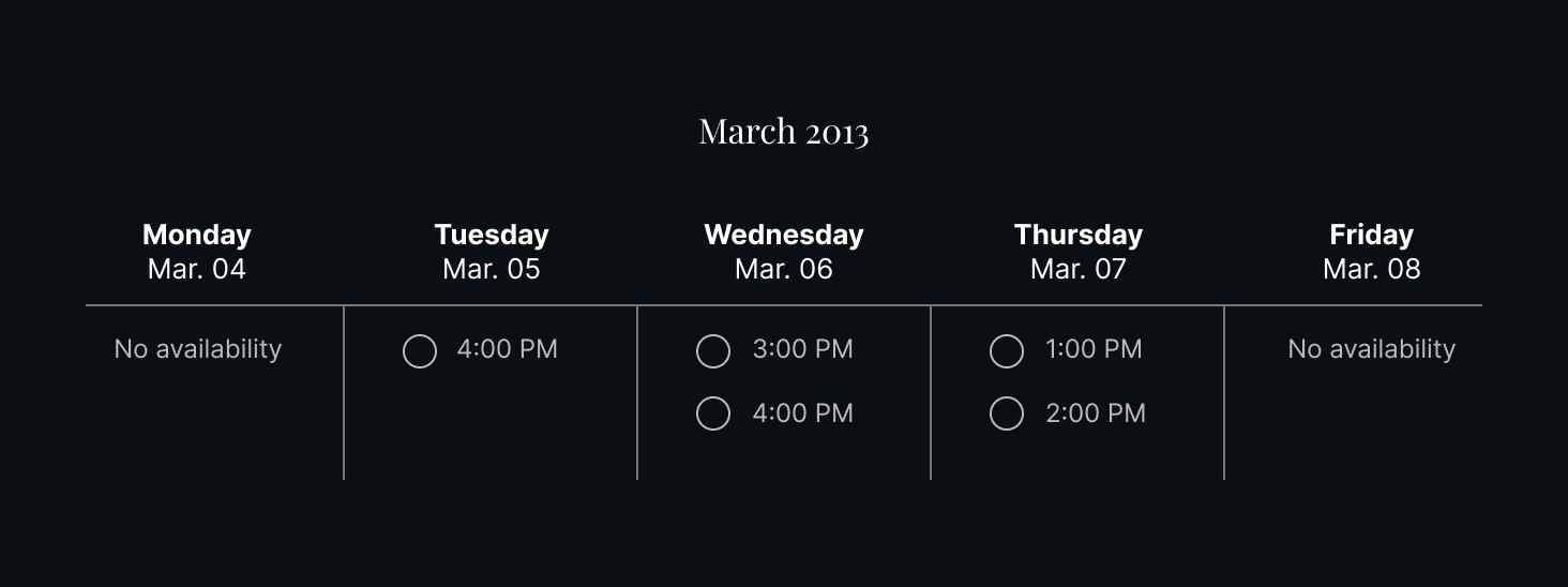
Of course, this won't work either, if there are lots of unavailability it just leaves me clicking week by week. The weekly view works for a secratary because they are working there and know the calendar and bookings very well. We, as customers are just looking at the calendar when we want to actually book an appointment. Flipping through weeks is not very efficient either.
When we are actually conversing to book an appointment, usually the business asks us a proposed time or if we prefer a specific time of day. Most working people may know their schedules or at minimum know the window of time and perhaps the days they are able to be flexible. This got me thinking - what if we were to show only the days that have availability, for the time frame we request? At first I tried a range slider, but this was too confusing for customers as we found out during user testing with my UX Research partner. So, ultimately we setup a way to divide hours into Morning, Afternoon and Evening and allowed multi-select; just in case someone is available either Mornings and Evenings for example.
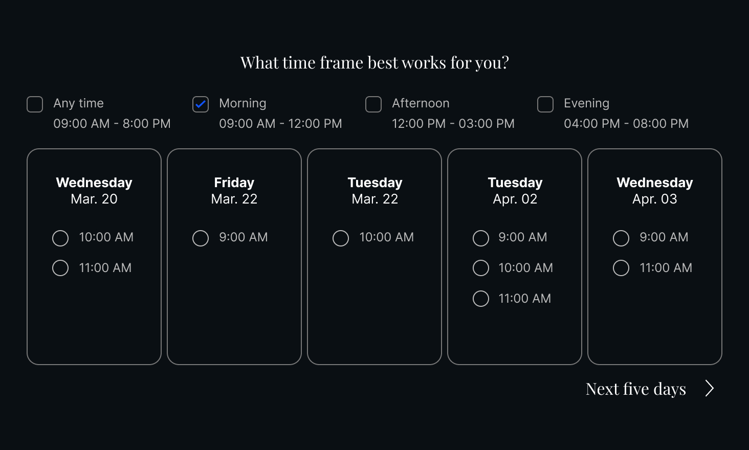
This is an even better alternative to the typical "First appointment available" suggestion calendars, because afterwards you are again cycling through days or weeks that could be fully booked. This calendar system however, will only show days that are available.