Apptimize
During my time at Apptimize I was the sole designer hired to design the product from the ground up. I was also in charge of the marketing website and managing the sprints for our front-end UI engineers, creating guidelines and components, and ensuring a consistent experience from sales to using the product
In this case study, I will cover one of the most important UX problems we had to solve for the product - learning how to be successful with A/B Experiments.
Background
One of the primary challenges we had as a challenge was training customers to build their A/B Experiments case.
>Many customers were new to the scene, and would often run experiments without really knowing what they are trying to measure. This lack of purpose in experiments lead them to believe the product wasn't worth it, or lead to many calls in customer success team.
Through our redesign and usability testing, we found a few kinks here and there that we definitely wanted to resolve as we built the product.
Restructuring goals
In the original Alpha version of the product (unfortunately I don't have screenshots), the user would setup the variables for their experiment, allocate the audience, then launch the experiment. After some time, they would be able to view results and add their goals.
Another major issue with the original UI was that our users had no idea they could set goals. This would lead them to believe the results were using a smart algorithm to surface key data that they should be aware of. A huge assumption that unfortunately wasn't true.
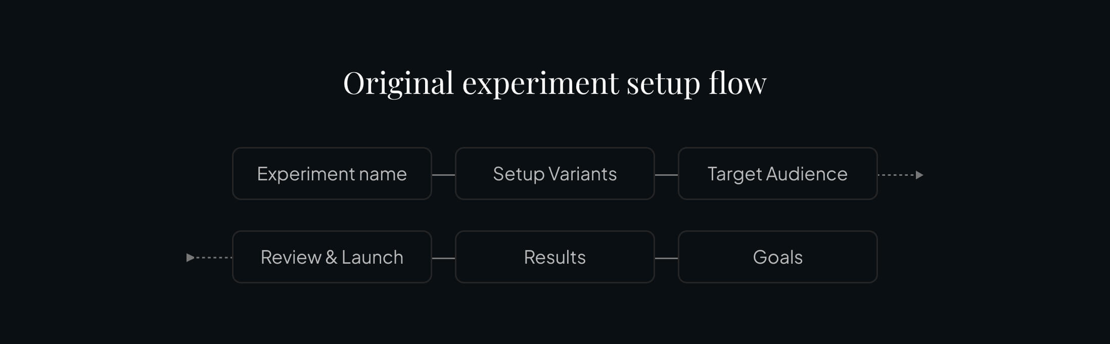
This idea of setting goals later was a big setback. After all, when we run an experiment, we have a hypothesis and set the element we want to measure for success before running the experiment.
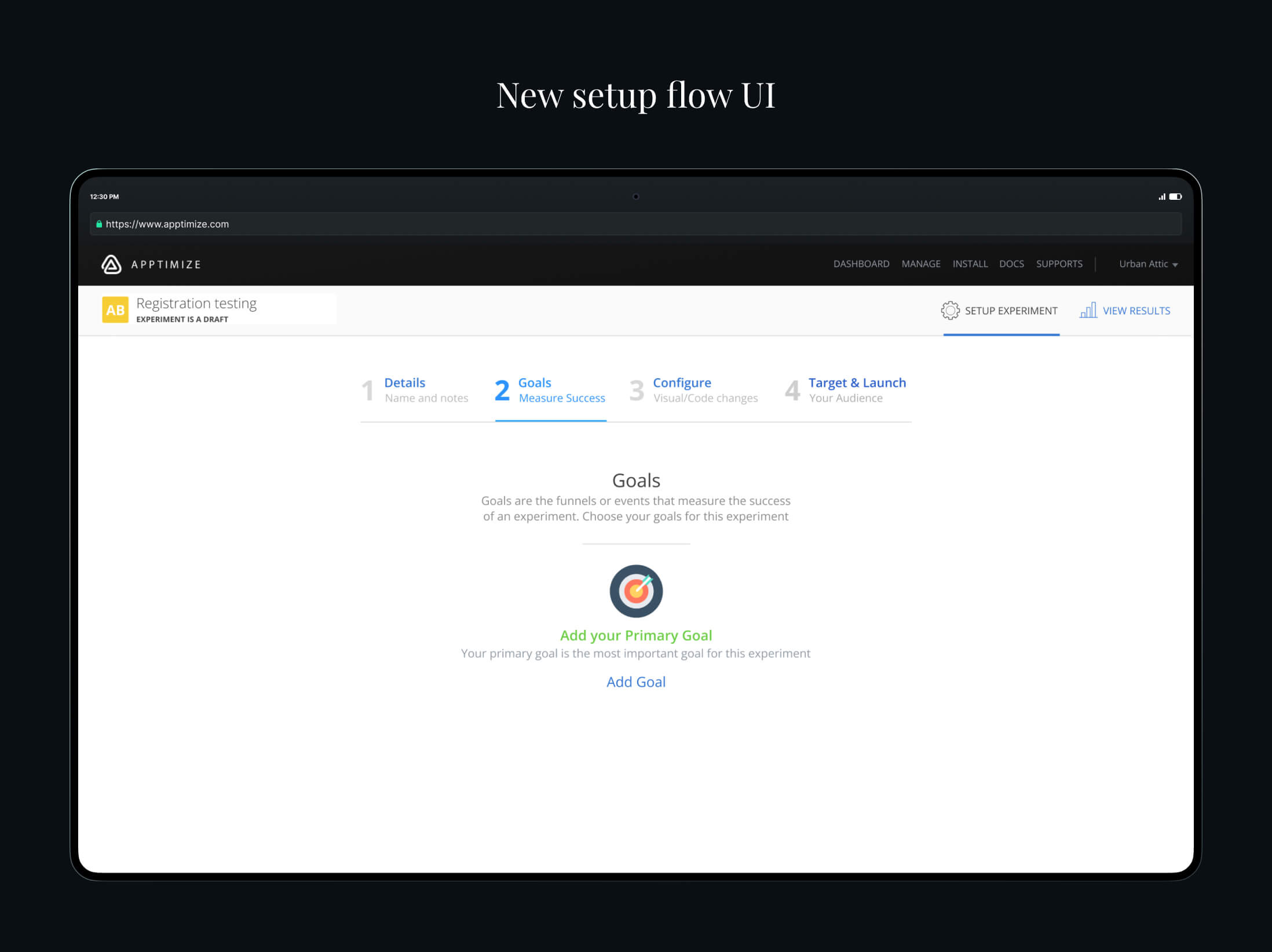
This new method of requiring goals to be setup from the start definitely decreased the number of experiments being run, however the quality of results for our customers was much higher, and they understood the value of the product.
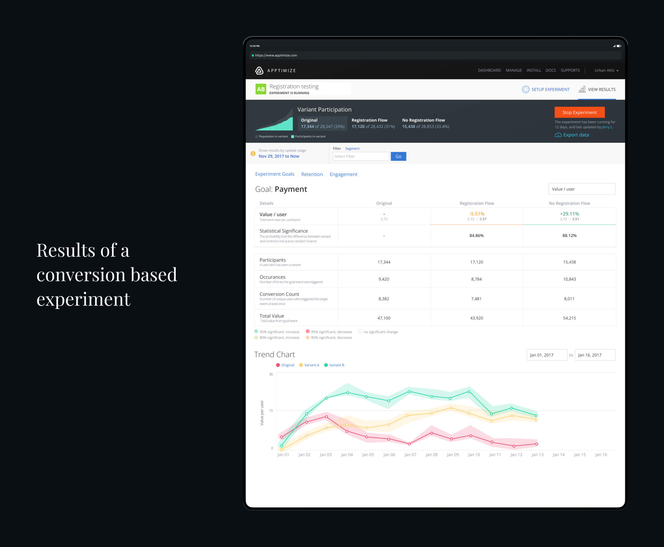
Results data
Another area we wanted to tackle is understanding of data. Many results pages we see will have the technical terms, but fail to explain what these terms mean upfront. When redesigning the results page, I wanted to make sure it was as self-onboarding as possible.
In our tables, we had descriptions of each label visible. We also had a legend that allowed them to understand the significance.
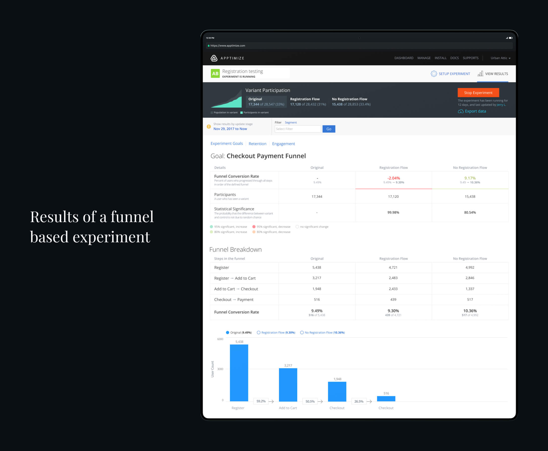
Funnel data
While working on the funnel data page, I did research and looked at so many different analytics platforms. Unfortunately, even as I worked on funnels, many of the representations were confusing. Many visualizations did not always represent each step in a clear manner, or never showed percentages up front.

With our interface, I wanted to make sure everything was clearly laid out, and key information was given up front rather than having customers have to calculate the details on our own.