Enterprise mobile navigation patterns
Enterprise software is complex, long-living and comes with a lot of legacy. In my career I've worked on quite a few different enterprise products, and through those experiences being able to adapt to mobile was an interesting challenge.
In this study, we will discuss a few new patterns that can all be packaged into a single but sprawling navigation system. I hope that it will help those readers in similar situations think outside of the norm and explore new patterns that may not be so widely adopted.
To give some preface, when I talk about sub-product section or simply section in this article, my meaning behind this is entire features that could be stand-alone products. For example, in a consumer banking application, having a foreign exchange section has its own complexities and could be it's own product. In fact, many of the enterprise software I worked with had their structure in this way, for better or worse. Each major feature were essentially their own products melded together by a complex spaghetti system we elegantly refer to as legacy.
In this study, there are three areas I will be tackling:
- The most obvious and important is that we want to ensure people do not feel lost in the product. They need to be able to quickly go from one section to the next with ease.
- Following this, we need to be able to scale the navigation in such a way that there is clarity between each section, while allowing each section to have their own navigation items.
- Finally, we want to figure out a new method for sub-level navigation items for each of these sections.
Section selection
Let's talk super applications. If you have ever had the chance to use a super application on a day to day basis, you would understand when I say they are comparable to enterprise products. Super applications have multiple sections and even mini applications within itself which can create a lot of confusion to the uninitiated user. However, there is a lot we can draw inspiration from that can be useful for enterprise adoption. Before we jump into the details let's take a look at a high level generalized navigation structure for enterprise software.
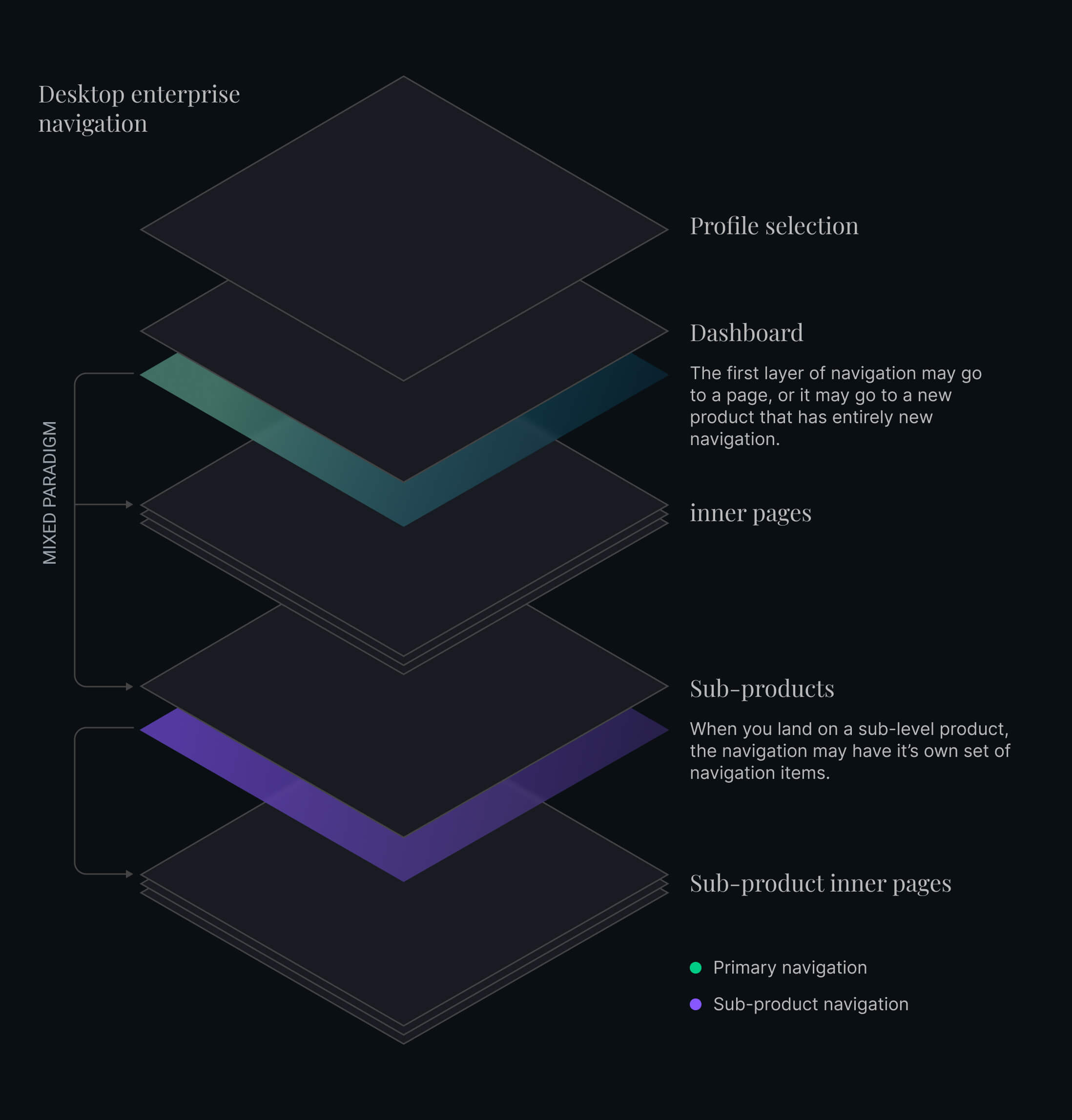
On desktop, we have a lot of real-estate to play with. Creating a sidebar navigation with levels upon levels and a breadcrumb to return back is a common pattern. Due to their complexity, any clumsiness or lack of exploration in to new ideas can be overlooked. On mobile however, it's a whole different ball game—and we must explore new patterns. Having a side bar with many levels won't fly when it is to fit in the palm of our hands.
In a lot of applications today we may see a shortcut panel developed as a primary navigation or shortcuts to new sections. These are often in the form of four or more icons in a tiled grid, and were first prominently found in super applications. I would have to say it's unfortunate that this type of pattern has been so widely adopted as is. These panels may seem like great idea in hindsight, but in almost all cases, it is only accessible from the home screen, and unless we can access this panel anywhere, their usefulness is little to none.
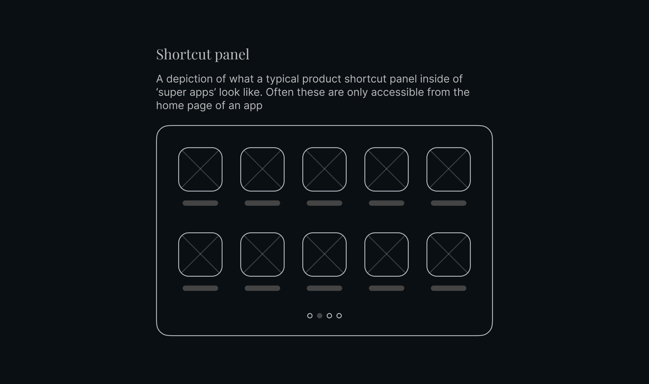
The problem with these applications is the need to click back multiple times to get back to the main screen. In some cases it is faster and easier to simply exit the application and reopen it. A mobile screen also doesn't have the real-estate to put an entire breadcrumb at the top of the screen, especially for enterprise where names and labels can be extraordinarly long. The shortcut panel isn't a lost cause however, if we could update the experience to make it it accessible from anywhere without intrusion, its usefulness may be restored.
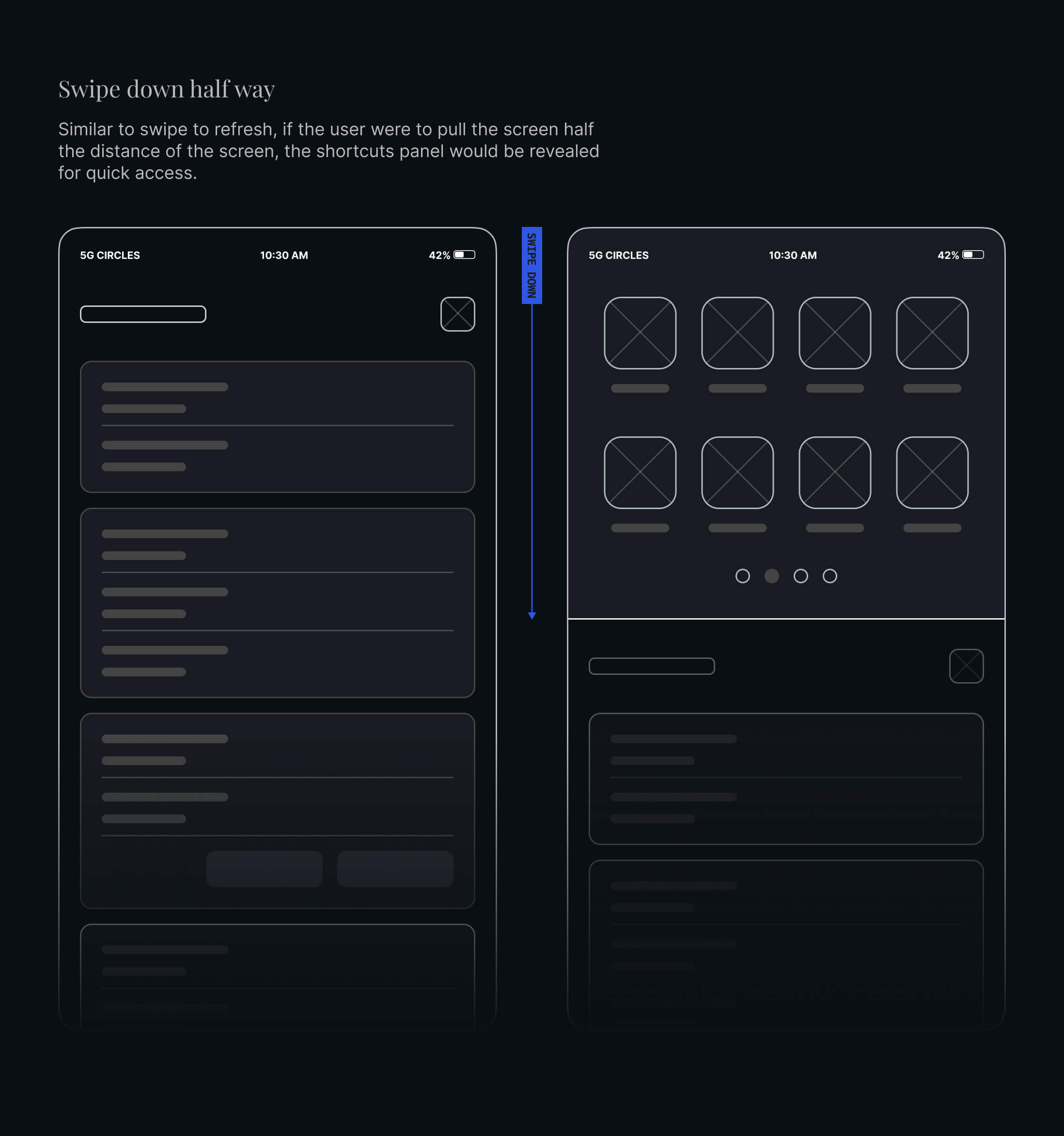
Taking inspiration from the paradigm of pulling down to refresh a page, we can devise a deeper page pull down action. In this case, if the user pulls the page half-way down the screen—the same shortcuts panel we saw on the homepage would appear. This is a very simple, non-invasive and non-obstructive integration that is accessible everywhere in the application. An easy and much needed escape route to other sections of the product.
Scaling the navigation
With our accessible launchpad and the idea of each sub-product being it's own section of the product, we can update our diagram with the new app structure. I want to rename the Dashboard to launchpad, because that is essentially what it is, a launchpad to the different areas of our product.
I want to be very clear. I do not expect each section to work in isolation, however with complex enterprise products, it's important to have some isolation while still following the same patterns and designs. Certain actions may cross-over to a new section, but this must be clearly stated. After completing the action that went to a new section, the user should be able to return to where they were.
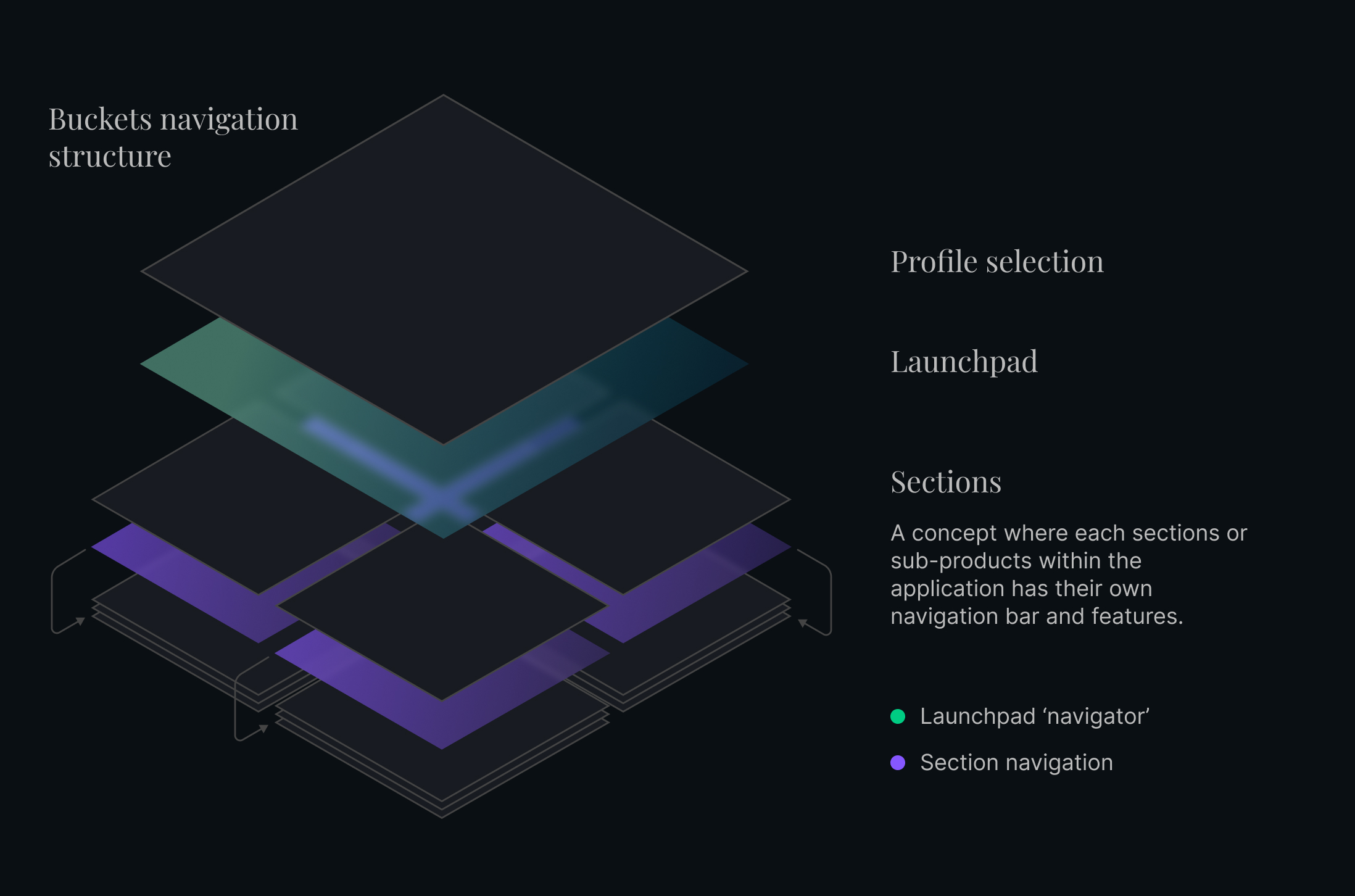
The launchpad can still have some level of summarization of latest updates. For example, if there are tasks to be completed in a certain section, the launchpad can mention those. Referring back to our shortcuts panel, we could modify it, so that there is a shortcut to go back to the launchpad, this way anyone can easily get back to the launchpad and view the summaries of each section.
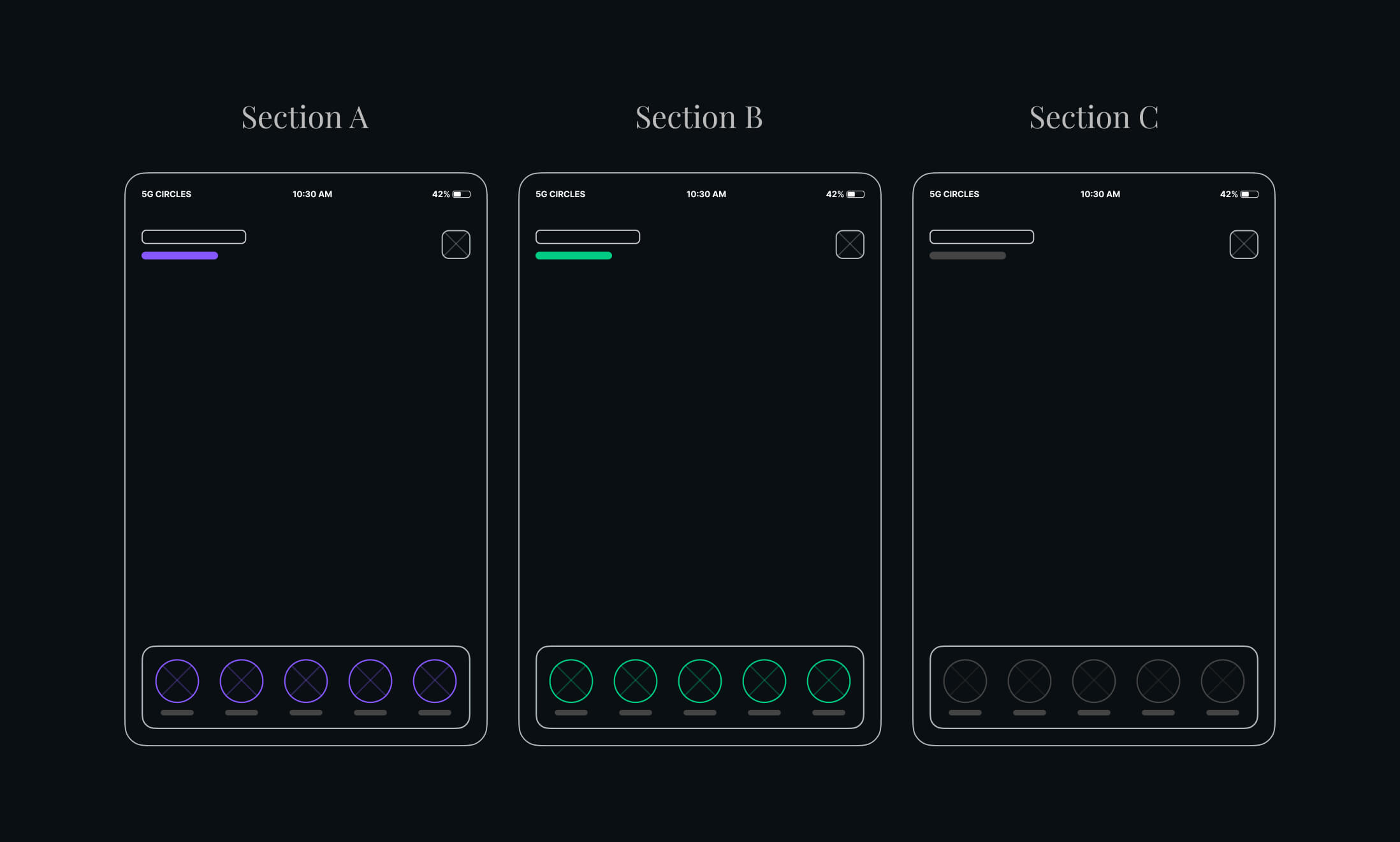
This new structure also enables us to give each sub-section their own navigation. This is our second level navigation, which can be very scalable. Each sub-section can have up to five items. This means if we have four sub-product sections as depicted above, our bottom bar has the potential to have 20 different items with minimal confusion. To reinforce this idea and improve the communication, we can give each section their own color theme, whereby the navigation and title communicate the section they are currently browsing.
Profiles
At this point, you're probably asking yourself, what about the profiles? They are the highest level in our diagrams and yet, I haven't addressed the issue. In the wireframes just shown, an icon is displayed in the top right of the application. Staying true to what is known and widely adopted, clicking this will bring us to user settings or let us change profiles. When we change profiles, we will be directed to the launchpad specific for that user.
Sectional sub-navigation
We've dived fairly deep into our navigation already, but now it's time take our navigation to the next level. We have a couple of roads we can take here, we can either go the old route of hamburger menu, or we can go with the bottom bar, or a hybrid of both. When I say hybrid, I'm not talking about the common pattern we see where four items navigate to a new page and the fifth expands into a new-age hamburger menu. No, not at all. I'm talking about turning ALL of them into a hamburger menu.
Are you totally mind-blown or about ready to gag? Well, hold that thought and hear me out.
If this is done with careful planning, we can build something completely new here. Let's take our bottom bar, and add one more gesture, a long press. If the user clicks the navigation as normal, they will go to the usual page they expect, where most likely there are some ways to get to deeper down pages. If, however, the user were to long press, a drawer would open up - listing all the tertiary pages for that particular page; and just like our shortcuts panel discussed before, the long press should be activatable from any page for any navigation item.
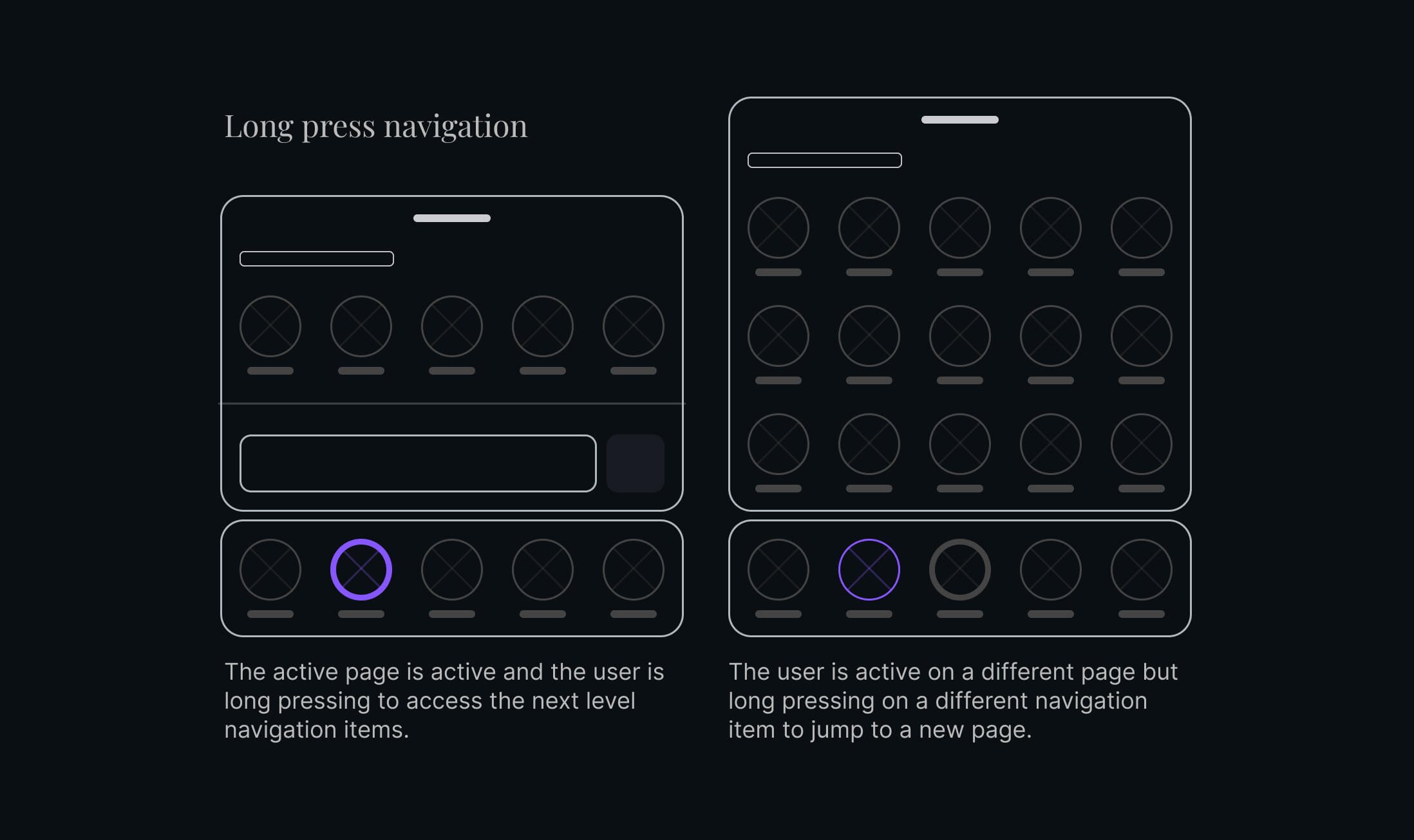
In the above diagram, we can see that on the left the user is active on a page they are long pressing, whereas on the right they are long pressing on a page that they are not currently active on. I display this state of a long press as a thicker border, however we can probably come up with something a bit more elegant. For example, we could say inactive pages are an outlined neutral color, active pages are outlined primary color, and long pressed pages have their icons filled. Just some food for thought there.
This new pattern opens a can of worms, and with all great patterns, comes great responsibility. We could really go wild on this and add functionality that gives quick access to top information. For example, in the FinTech world, maybe it enables a quick view of recent transaction details and lets you copy those details into a report on the current page you are on. That probably wasn't the best example, but you get the idea. This long press panel can be a beautiful beast or if left untamed and without rules, it can turn into the ugliest usability nightmare we've ever dealt with.
I wouldn't discount the idea of having a more section even in combination with this paradigm, but I would have to ask—does the items in the more section fit here? For example user settings, would settings exist in the profile global level or at sub levels? It really depends. With all things, adaptation depends on the product, and I hope that this can expand your horizon to new suggestions.
If you do use this or extend its use cases, I would love to hear from you and understand what is working or not working for you.