Contrast Matching Tool
Colors are tricky. If you have experience building accessible color ramps in your design system, you will know this as the cold hard truth. For those unaware, our goal here is to create colors in each theme as pairs matching color contrast. This creates confidence for designers to create a design in one theme and know that the other themes will work just the same with little to no testing.
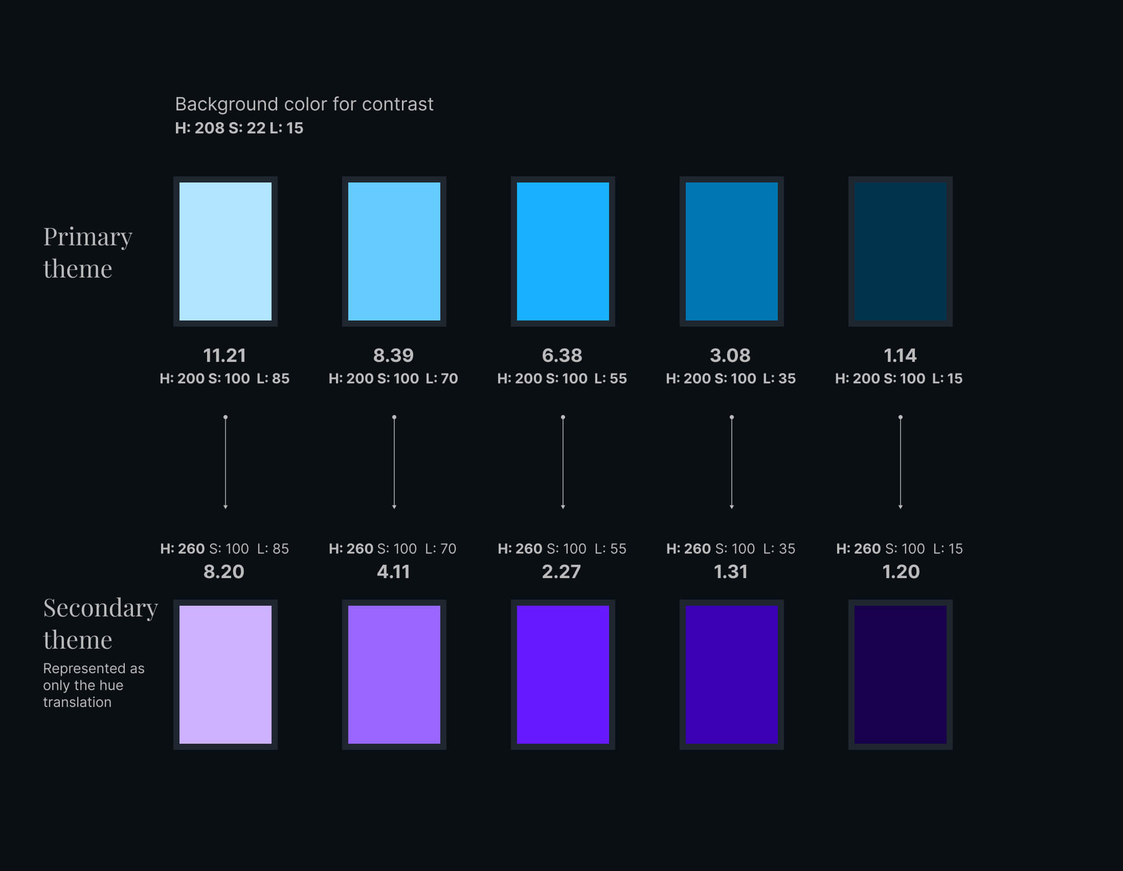
There are many discussions online about how to build color systems with color contrast and accessibility in mind, but when it comes to multiple product themes the challenge increases. With color ramp generators, we can still only get the primary color theme, however for secondary themes we can't just use the generator again, since the colors won't match. For example a nice blue color contrast won't match with a violet color.
| Color | HSL1 | Contrast | HSL2 | Contrast |
|---|---|---|---|---|
| Background | 208, 22, 15 | |||
| 001 | 200, 100, 85 | 11.21 | 260, 100, 85 | 8.20 |
| 002 | 200, 100, 70 | 8.39 | 260, 100, 70 | 4.11 |
| 003 | 200, 100, 55 | 6.38 | 260, 100, 55 | 2.27 |
| 004 | 200, 100, 35 | 3.08 | 260, 100, 35 | 1.31 |
| 005 | 200, 100, 15 | 1.14 | 260, 100, 15 | 1.20 |

As you can see from the table above, only changing the Hue in HSL (or HSB) will not solve our problems. The current method to create such sub-level theme is a very manual process. Currently we have to go through our primary ramp color by color, using each as a foundation, to then find a new color to fit the secondary or tertiary theme slots, all while trying to balance saturation and lightness and contrast. If you're like me, you probably discovered early on that HSB/HSL makes this process a bit easier.
Others have tried a process whereby they attempt to match the gray value in each pair. This is not an efficient method to pairing up colors since matching the gray value doesn't guarantee a matching contrast ratio.
| Color | HSL | Contrast | Grayscale | Contrast |
|---|---|---|---|---|
| Background | 208, 22, 15 | - | - | - |
| Primary | 60, 100, 50 | 14.14 | 60, 0, 50 | 3.84 |
| Secondary | 256, 84, 98 | 14.14 | 256, 0, 98 | 14.51 |
We can see from the example that even if the color contrasts match, the grayscale can have a vastly different results. Therefore, we cannot rely on matching colors through their gray values as a 'fast' matching method.
Calculated vs Perceived contrasts
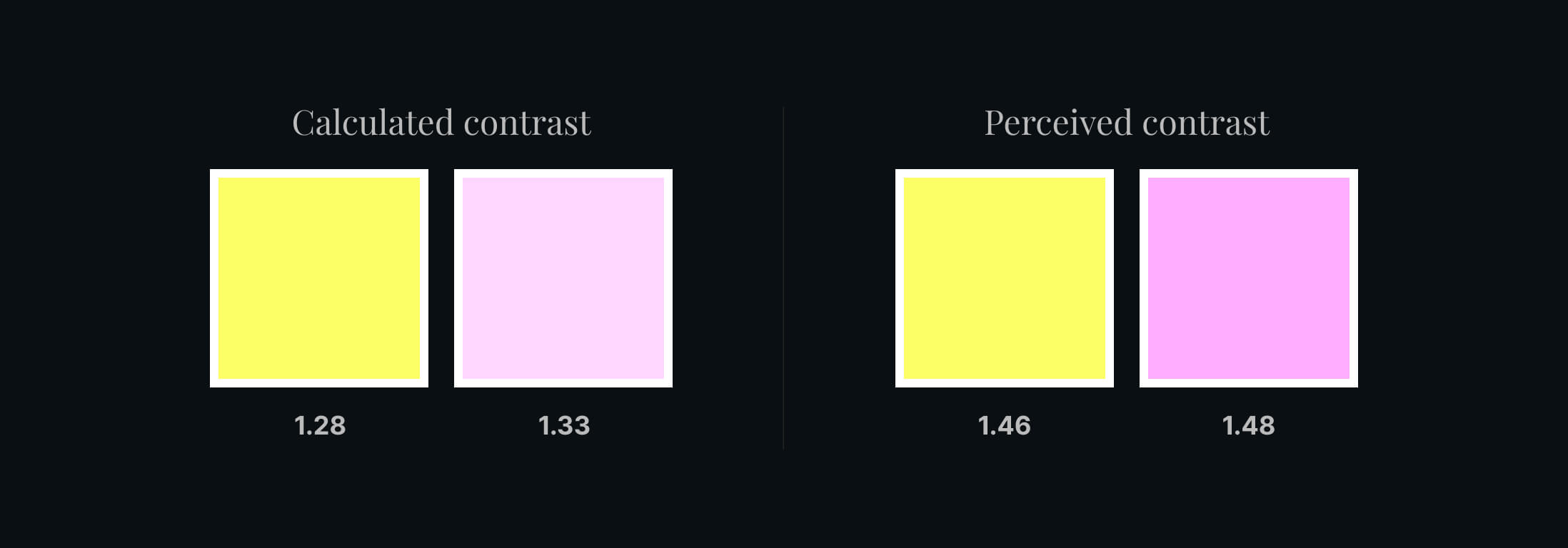
Did you know there are two types of contrast ratios to calculate? I only just learned about this while researching to create this tool. The calculated contrast is what we are familiar with see in tools, however, I recently learned there is a way to calculate the perceived contrast; which is what most people will actually see as matching contrasts
Of course, what we actually see may not be reliable; which is why it is so difficult to make the themes. However, using the perceived contrast for decorative colors could be a great use case, whereby legibility is not necessary. The differences can be subtle, but they are definitely there.

| Color | HSL | Contrast |
|---|---|---|
| Background | 0, 100, 100 | - |
| Primary | 144, 100, 70 | 1.28 |
| Calculated | 300, 100, 91 | 1.33 |
| Perceived | 300, 97, 84 | 1.48 |
Contrast matching system
Now you can see why it can be so troublesome to find colors, especially manually. That's why I thought there has to be a better way. I created this tool in python that takes in the HSL values for a foreground, background and the new hue value for a secondary theme.
Please enter the foreground color HSL values (0, 0, 0): 144,100,70
Please enter the background color HSL values (0, 0, 0): 208,22,15
+------------------------------------+
|         First pair results         |
+------------------------------------+
Contrast calculated is: 11.858
Contrast perceived is:  10.437
--------------------------------------
Please enter the new foreground Hue to match (0 - 259): 300
This tool will then output two new colors, one for calculated and one for perceived contrast. The tool also prioritizes saturation to try to get a color as close to the saturation as possible from the original.
--------------------------------------
Calculated contrast match:
--------------------------------------
H:300, S:100, L:92
Contrast ratio: 11.812
Contrast difference from origin: 0.046
--------------------------------------
Perceived contrast match:
--------------------------------------
H:300, S:97, L:85
Contrast ratio: 10.537
Contrast difference from origin: 0.1
How does it work?
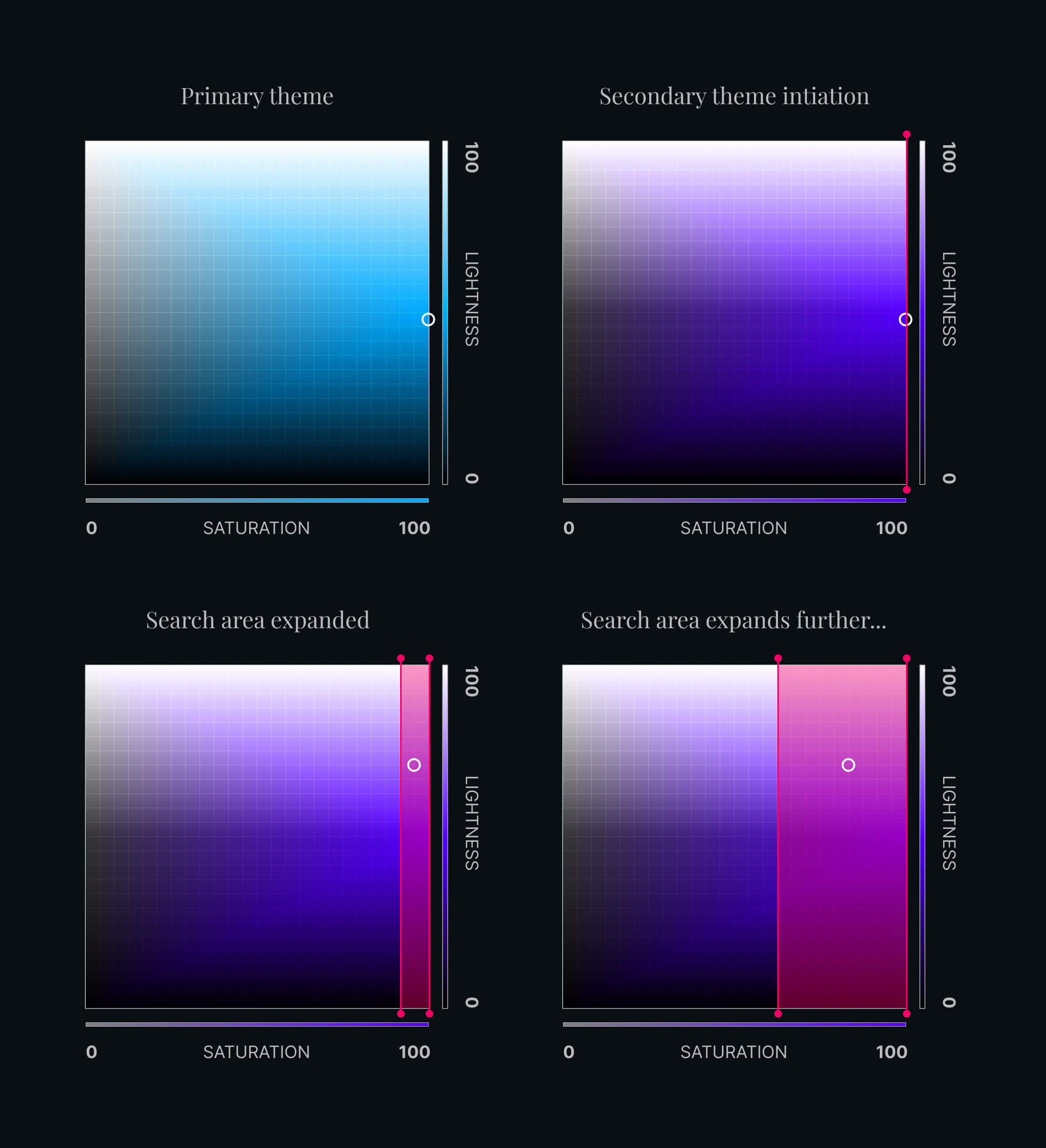
The program takes the new Hue and the saturation of the original color as a starting point. It then checks each lightness value, if none match within the threshold, it widens its search across the saturation range, and keeps iterating until a match is found. If a match is found, it will stop immediately, giving you the result nearest the saturation and lightness of the original color.

It is entirely possible that within the range given, a color matching cannot be found, in that case you may want to adjust the threshold. I have found the sweet spot is .01, but you can narrow or widen this threshold. This basically says that the contrast of your new color must be within ±.01 of the primary color it's being paired with.
Another point to look out for is if the saturation or lightness has a large margin from your original color. Usually this indicates the threshold is too small, and you may want to allow for more wiggle room.
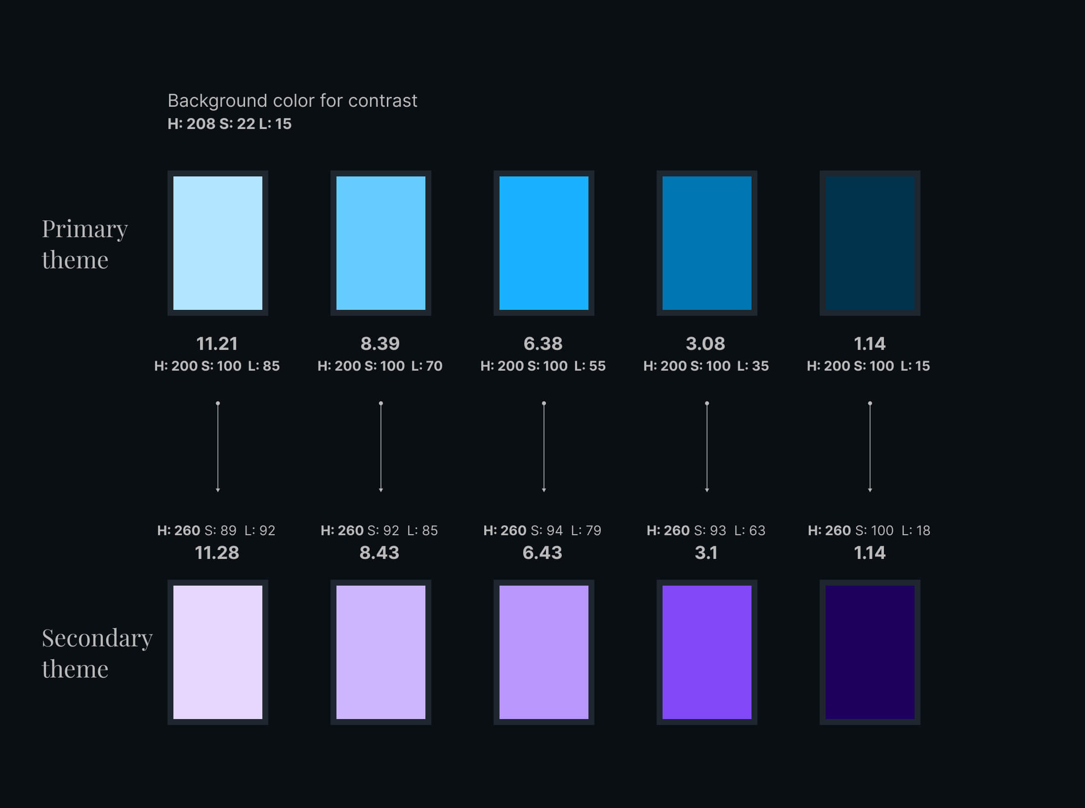
Let's now fill in the diagram from the start and see what this program will produce as matches.
| Color | HSL1 | Contrast | HSL2 | Contrast |
|---|---|---|---|---|
| Background | 208, 22, 15 | Threshold: ±0.01 | ||
| 001 | 200, 100, 85 | 11.289 | 260, 89, 92 | 11.280+.09 |
| 002 | 200, 100, 70 | 8.421 | 260, 92, 85 | 8.429+.08 |
| 003 | 200, 100, 55 | 6.432 | 260, 94, 79 | 6.429-.03 |
| 004 | 200, 100, 35 | 3.099 | 260, 93, 63 | 3.097+.02 |
| 005 | 200, 100, 15 | 1.142 | 260, 100, 18 | 1.142+.00 |

Not half bad if I do say so myself! So what is the future of this tool you ask? If there is interest, I may add some functionality to bulk find colors, fine tune tweaking, and of course fix any obvious issues users find! There are definitely some optimizations that can be made, but for now it's a good tool to play around with.
Contrast Matching Tool
Welcome to the color contrast matching tool. This will find a color to match the same contrast as your existing foreground color, given the hue of the new color to be generated.
If results are not as expected, it's recommended to set the threshold t one of these values: .01, .005 or .001